Best data visualization practices and analysis

In a data-flooded world, the ability to analyze and visualize information effectively has become an invaluable skill. From selecting the appropriate graphs to choosing effective colors, there are a series of best data visualization practices that can make a difference in data presentation and comprehension. Let’s explore these essential practices and how to apply them to enhance data analysis and visualization.
Data Analysis: Best Practices
The first crucial step in the visualization process is data analysis. Here, the proper selection of graphs, the use of effective colors, and the creation of a narrative behind the data play a fundamental role. Let’s delve more deeply into some of the best data visualization practices.
1. Proper selection of charts
Every dataset has its own story to tell. Choosing the right chart is crucial for conveying that story clearly and effectively.
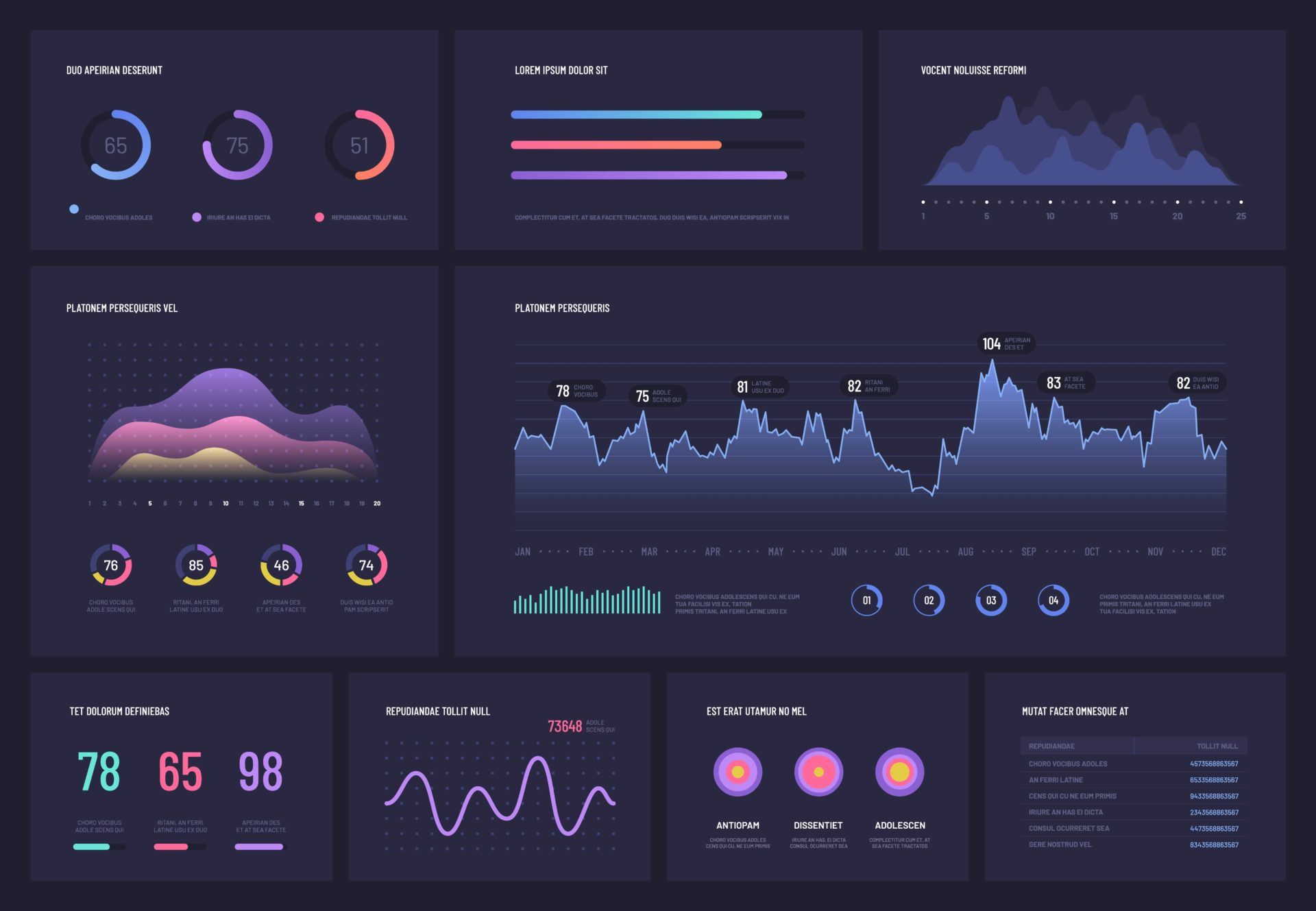
The charts available to us are numerous. However, we should not choose them based on whether they look more or less attractive. When selecting a chart, we have to consider what information we are presenting and what will be the best way to visually represent it so that it is understood and appropriate conclusions can be drawn. Then we can decide whether it’s better to use bars, lines, maps, etc. This first data visualization practice is key to organizing information effectively.
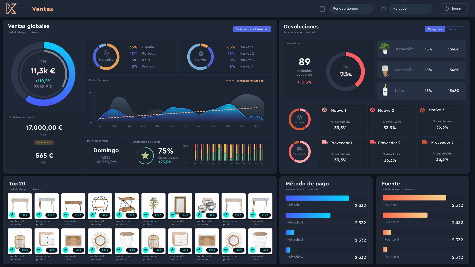
2. Effective use of colours
Another data visualization practice is knowing which colors to use. It’s a powerful tool for highlighting important information and making it understandable. However, colors must be used judiciously. They should be consistent and meaningful, avoiding:
- Excessive use of bright colours, which can be distracting.
- Using colours without meaning. Each colour has a significance: green when something is going well; red when something is not working as it should. But without overdoing it.
- Not considering the contrast rule, using sharp colours that stand out well from the background and are easy to read.
3. Narrative behind the data
Data alone can be confusing and difficult to interpret. This is where narrative comes into play. Storytelling. By contextualizing information and making sense of it, we help users understand the story the data is telling. This involves a good distribution of information on the dashboard, ensuring that each element contributes to the overall understanding of the dataset. Using hierarchy, playing with module sizes, etc. In short, contextualizing the data and making it understandable.
4. Design principles
Design principles, such as those from Gestalt psychology, also play an important role in data visualization. These principles, including proximity, similarity, enclosure, and closure, can help organize information in a clear and coherent manner.
Data visualization: best practices
Once data analysis is complete, it’s time to visualize it effectively. Here are some best practices in data visualization to keep in mind:
1. Clarity
Simplicity is key. The information we display should be presented in a clear, straightforward manner that is easy to understand.
2. Readability
Use legible fonts and avoid background fills that make it difficult to read the information. The size, color, and orientation of the text should have hierarchy and facilitate the understanding of the displayed data.
3. Balance
Overloading charts with formats, colours, unnecessary data, and elements is of no use. Ensure that the visual representation of data is balanced and easy to read.
4. Simplify colour
The simpler the colours, the better. Avoid using very bright colours or every Pantone shade imaginable. Use a simple and consistent colour palette to make the information easy to consume.
5. Share the right message
A good data visualization practice is to tell stories effectively. Ensure that the dashboard is not confusing. Transmit the information in an easy-to-understand manner so that anyone knows what the data is saying. Consider what data to include, which charts and colours to use, who will consume the data, and their role within the company. Let’s avoid misinterpretations in the information we present.
The importance of data visualization
To sum up, data visualization is a powerful tool for communicating information clearly and effectively. The ability to present data visually allows for the detection of trends, patterns, and outliers more quickly and efficiently than text alone. By communicating data through imagery, we can harness the power of our visual system to enhance understanding and retention of information.
In a data-driven world, mastering the best practices of data analysis and visualization is essential for making informed decisions and effectively communicating ideas. By applying these practices, we undoubtedly improve the way we analyze and present information.