Guide to data visualization: what it is and practical examples
Information is an undeniable asset. Some speak of the new gold. Others the oil of the 21st century. There is no doubt that it is the engine of growth and innovation in companies. However, the real wealth lies in our ability to turn data into knowledge. This is where data visualisation comes into play, a tool that allows us to understand and make the most of its potential.
What is data visualization?
Data visualization is the translation of quantitative information into a visual language that allows us to understand it much better. This process requires that we have the right tools so that the translation and reading of the information is clear, effective and simple.
To make the understanding of the data effective, we will use visual elements such as graphs, tables or infographics to organize the information in an attractive and useful way.
We are often unaware of this. But in today’s digitized environment, in everything we do, we generate hundreds of data, both personally and professionally: from sending a whatsapp, browsing social networks to managing clients, controlling invoicing data, etc.
Precisely for this reason, data visualization becomes a great ally for us to be able to detect trends, patterns and any deviations or outliers. In this way, we obtain quick information that allows us to make better decisions.
Data visualization vs Data Diogeneses
We are constantly bombarded with information and the massive generation of data is counterproductive. Millions of gigabytes of data are generated every day in the world. Moreover, we become obsessed with having as much as possible. This is known as “Data Diogenes”. Companies can work with between 20 and 50 data sources. What does this lead to? That we have a lot of unstructured and duplicated data.
Therefore, its correct management requires good data visualisation. The brain is visual, it processes images 60,000 times faster than text. When data is shared through visual formats, people understand better and faster what it is intended to convey and extract its full potential.
Visualization is the art of converting data into clear and understandable visual representations, from very simple graphs to interactive visualizations.
Storytelling through data visualization
Each graph, each image is part of a whole, of a story that allows us to better understand the big picture of what is going on in our company.
It is not a simple list of numbers or references. It is a powerful communication tool that facilitates data consumption.
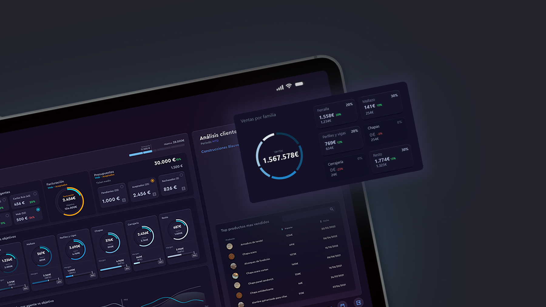
Data visualization is usually done through business dashboards. Dashboards allow us to select and display the most relevant data.
In addition, teams can explore the data themselves through dashboards, having total freedom to delve into the information they are most interested in, increasing their commitment and involvement in the project.
In a dashboard, many data visualization techniques are used. Depending on who is going to consume the information, what it is going to be used for and how it is going to be consumed, we will use one type of graph or another.
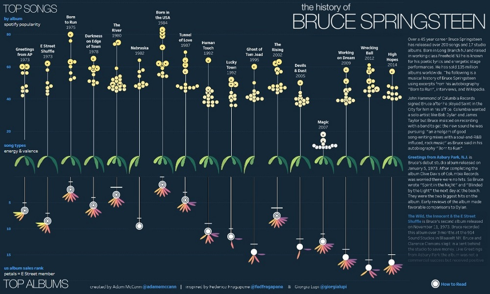
This data visualization by Adam McCann, for example, shows all the songs recorded by the artist Bruce Springsteen. Using data from Spotify and other sources, his songs have been distributed by popularity rank. A very visual and attractive graph, which would be much more “lazy” to read if the data were displayed in numerous Excel rows and without intuitive visual elements.
Examples of data visualization
Here are some examples of data visualisation that demonstrate how data can be represented effectively and attractively.
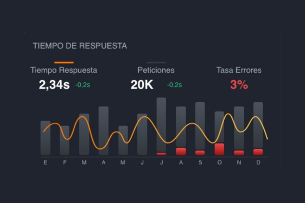
1. Bar and line graphs
Arguably one of the most common and effective forms of data visualisation and distribution. Line graphs are best suited to displaying trends, while bar graphs show, for example, the number of sales per month.
2. Heat maps
Ideal for visualizing the spatial distribution of data. For example, to show population density in different regions, with darker colours indicating more densely populated areas.
3. Scatter plots
Useful for showing the relationship between two variables and identifying patterns or trends in the data. For example, the relationship between the price of rent and the area of the city.
4. Pie charts
Ideal for showing the proportion of different categories in a data set.
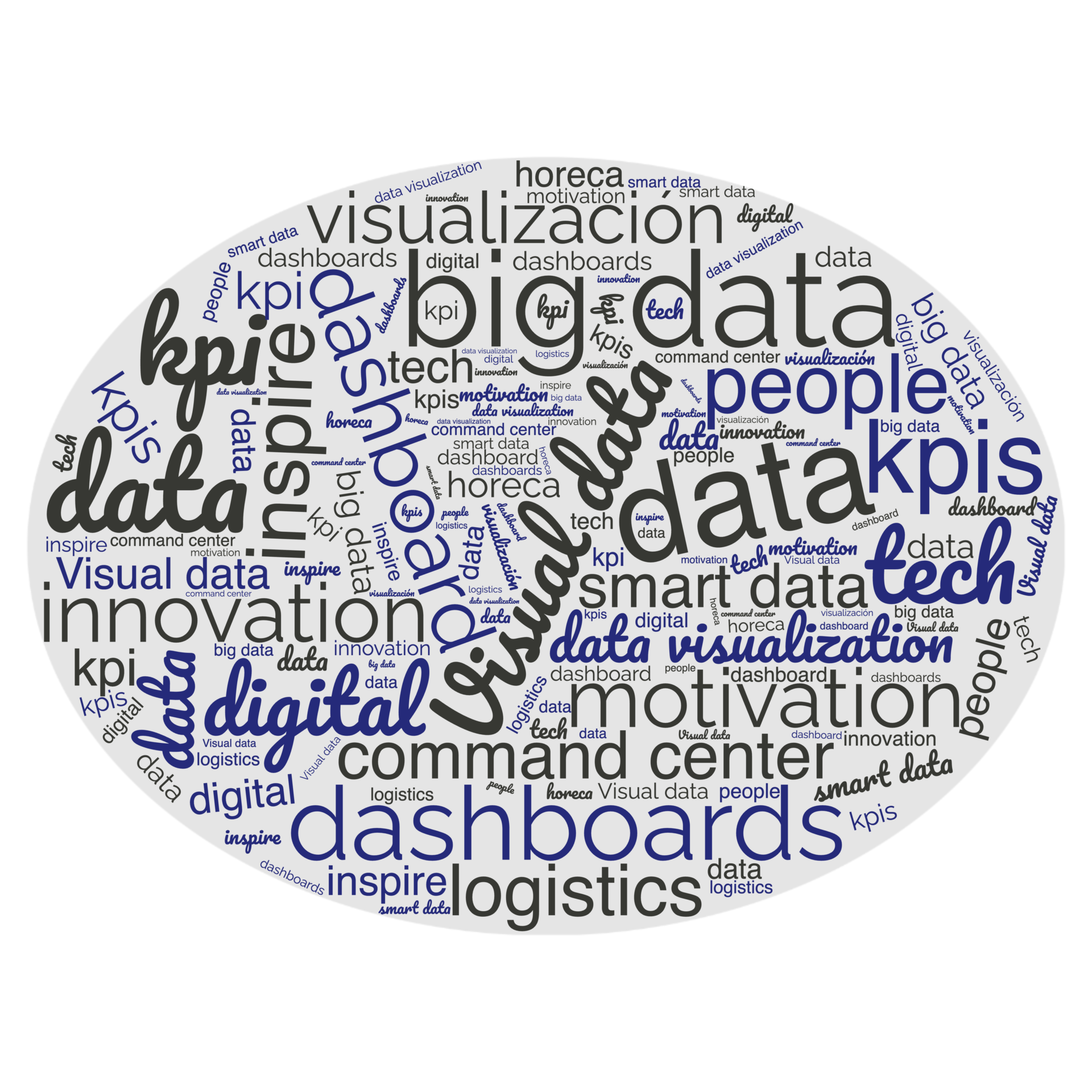
5. Word clouds
Show the most frequent words in a dataset. The larger a word appears, the more frequent it is.