Painting and coloring of Big Data
We have often been defined as the “paint and color” of Big Data. Far from seeming pejorative, it is a definition with which we feel identified. The “paint and color” is the Visual Data and it is as important in a BI project as the data extraction part or the back logics. If the numbers are very well calculated but I am not able to interpret them because the data visualization is terrible, the project is useless. But if we have a perfect visual and the data is incorrect, neither. Both phases must be excellent.
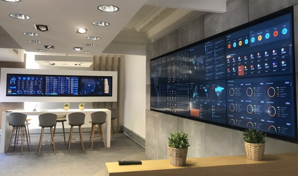
Excellence in data visualization has many aspects:
- Correct selection of graphics.
- Proper layout and size of each module in the design.
- Movement.
- Colors.
But today, we are going to focus a little more on the purely aesthetic part. Have you ever wondered why certain things taste or we perceive them better if we decorate them as if they were luxury items? For example: wine. If it’s cheap but you drink it in a glass that doesn’t look cheap, it will taste better, and if not, try it.
The same thing is happening with design. We are increasingly influenced by designs/products that provoke more emotional responses in us, establishing a deeper relationship between the user and the way he/she interacts with the product. This is called Emotional Design.
In the book Emotional Design. Why Love (or Hate) Everyday Things (I leave the summary here), written by Donald A. Norman, explains the importance that has acquired in recent years the emotional design, which influences the feelings of people and seeks to create a bond or connection that goes beyond the utility / functionality of the object. I leave you the purchase link on Amazon, in case you are interested in acquiring it.
In Marketing, emotional design is applied to achieve a sale, to confer certain attributes to the product and therefore to the user who buys it, to gain followers… . But what if we talk about data? Is it possible to arouse emotions with them? Is it useful?
Usually, when we think of data we think it is something boring, tedious, complicated to understand…. However, in recent years, numerous BI solutions have emerged on the market that focus precisely on “painting” information on impressive dashboards. Numerous studies have been carried out on the user/product relationship, which have ended up concluding what Donald A. Norman states in his book:
“It is no longer enough for objects to be functional for them to work, attractive things work better.”
And this is totally extrapolable to how users perceive data: it is not the same to see the month’s business results in an Excel table as in a visually attractive dashboard.
There are two well-known experiments in the design industry that were conducted in the 1970s in Japan and Israel, and in both countries the same results were obtained. The study subjects were confronted with using the interface of an ATM in different versions. All of them had the same functionalities, but the vast majority of users perceived more useful, more intuitive and better understood, those that were aesthetically more beautiful. Here is a link to an article that details this experiment in more detail.
So what makes a good design? Some might say that it’s something very subjective, that it depends on the eyes with which you look at it, and so on. However, it is much simpler than that. A design is really good if it arouses an emotion in the user while using a product or service or, in our case, if the dashboard causes that wow! effect in the user who is consuming the data and provokes interest in being viewed.
In summary, don’t disregard the importance of aesthetics (in addition to utility of course) in the design and development of your dashboards. It is much more important and effective than you might imagine.