What is a dashboard: a complete guide
A company needs data to grow. Teams rely on data to make better decisions. What is a dashboard? The dashboard is a visual tool that helps in this process, as it reflects the metrics or KPIs that companies consume on a daily basis.
Data at a glance. Agile decisions. Continuous improvement. Let’s see what is a dashboard and what its role is in the day-to-day running of companies.
What is a dashboard and features of a dashboard
A dashboard, also known as a control panel, is an interface that visually displays and facilitates the understanding of key information for monitoring the day-to-day running of your company.
We are data diogeneses. Companies generate hundreds of data every day. Data that comes from multiple sources of information: CRM, ERP, social networks, invoicing programmes, etc. When it comes to reporting and drawing conclusions, it becomes a cumbersome and time-consuming task. You have to manually enter each of the software, analyse the data and then unify them and try to understand how we are doing. What alternatives do we have? The dashboard.
What is a dashboard used for?
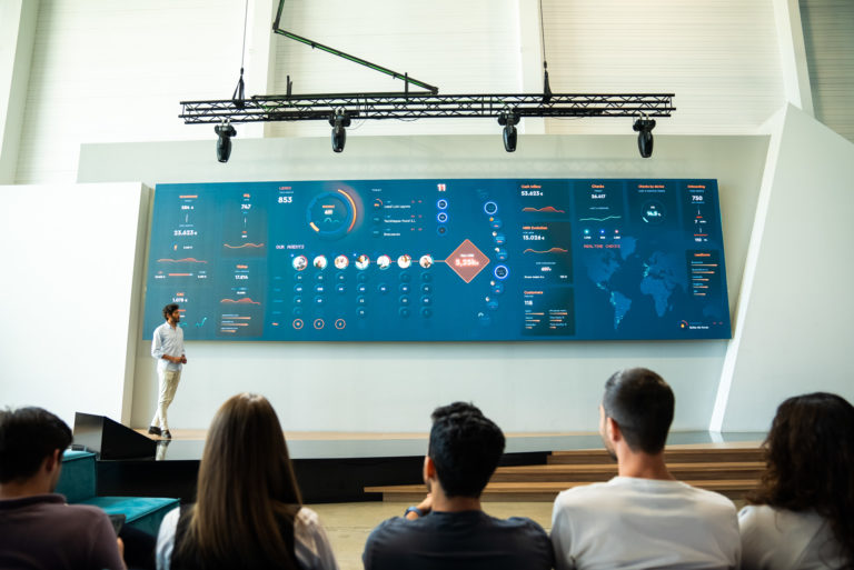
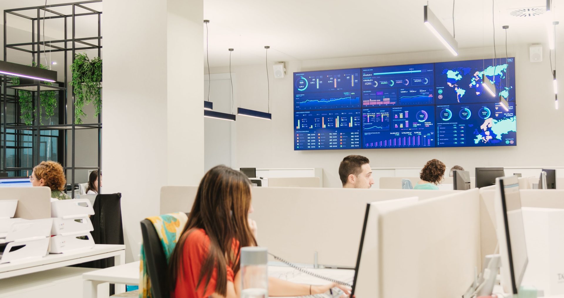
Rare is the company that does not use a dashboard in its day-to-day business. Simpler or more complex, but just as we consume information on a personal level through dashboards (for example, in banking apps), it is also necessary to use them on a professional level.
Let’s look at what is a dashboard for and why it is so useful for decision making:
- Monitoring of key performance indicators (KPIs). There is constant and continuous monitoring of the KPIs of the company or specific department, such as turnover, sales, customer satisfaction, among others.
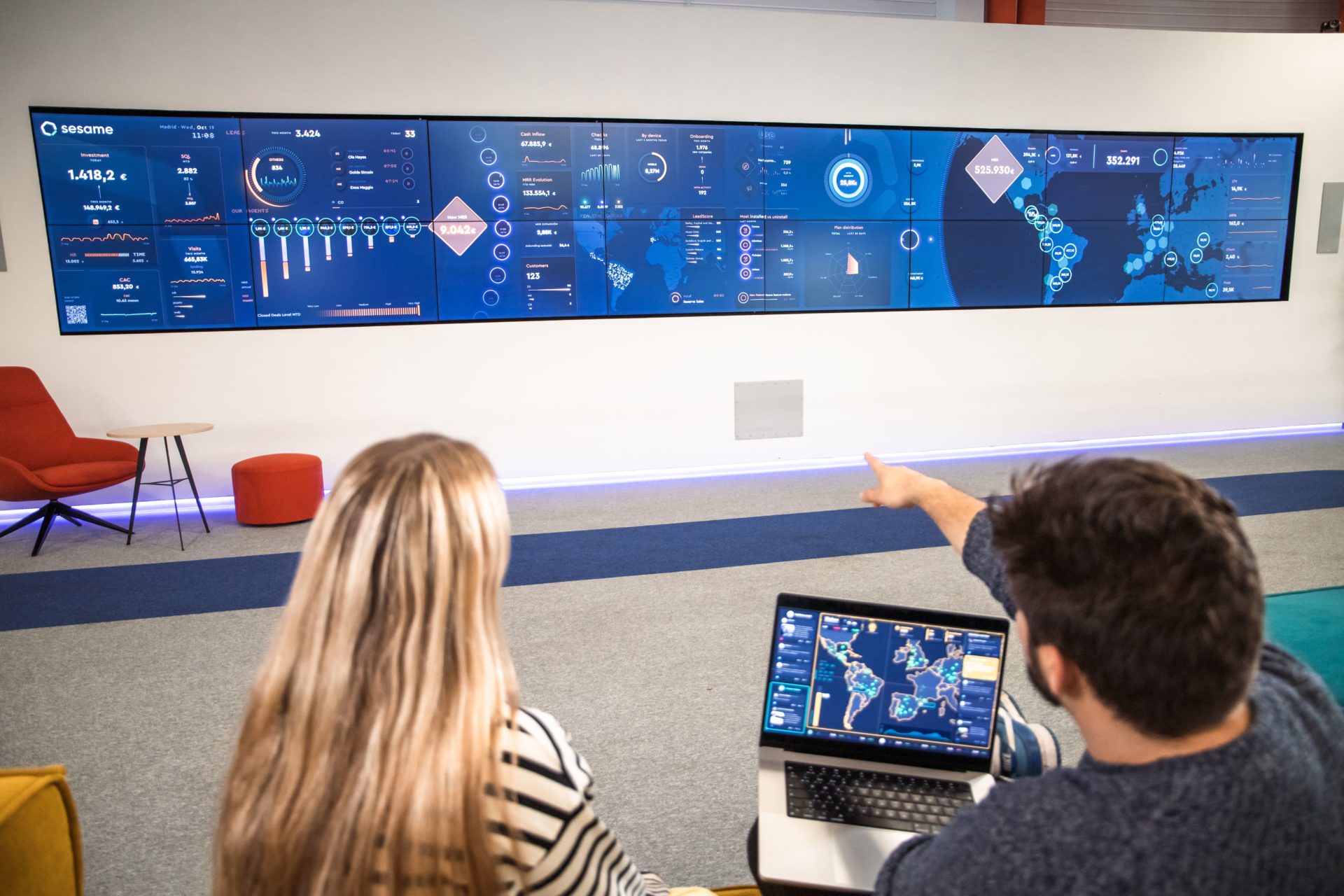
- Real-time data visualization. Dashboards give us the opportunity to access up-to-date data at a glance. In addition, the information is updated in real time, so we ensure that we are consuming the right data, on time and being able to make decisions in an agile way, having a global and instantaneous vision of the current state of the company’s processes.
- Identification of trends and patterns. Visualising data on a dashboard through graphs, tables and other visual elements makes it easier to understand. We will be able to identify trends, detect anomalies and deviations and thus help to take corrective action and seize opportunities.
- Informed decision making. By having a cross-sectional, clear and concise view of information, dashboards enable managers and decision makers to make better decisions in much less time. We will be faster, more efficient and more competitive.
With visible data, we make better decisions. Thanks to the dashboard, we have the metrics that really matter to us at a glance. A way to help the team, who will now be able to go into the office, consult the dashboard and, in less than a minute, know what happened yesterday and what measures they can take and apply today to improve and achieve the specific objective.
What should be included in dashboards?
The dashboard is a tool that enhances decision-making based on real-time data. However, not just any dashboard will do. We tell you what is a dashboard and what must have to be effective:
- Clear data. The dashboard does not need to be cluttered with information. Companies have a wealth of structured and unstructured data. Once extracted, cleaned and ready to analyse, it is time to integrate them into a dashboard. However, the dashboard should not be overloaded with dozens of KPIs. Let’s keep it simple. Let’s have at our fingertips the data we need on a daily basis to make decisions in an agile way. Then there is always time to delve deeper into the information and work on it in more depth. But the function of the dashboard is precisely to simplify and help to understand the data in a matter of seconds.
- Advanced filter settings. The dashboard tells stories through data. It must be able to have multiple dimensions and parameters. Following on from the previous point, all the information cannot be at a glance, it would not make sense. It would be a dashboard that would be very difficult to read and understand. So, you have to make use of filters. These make it easy to visualise volumes of structured data, compare current data with historical data, break down demographic data and segment data by region. A way to have the information available and integrated in one place, saving a lot of time and optimising resources.
- Aesthetic design. To make a meaningful dashboard, we are not going to put graphics because they are more or less beautiful and put colours that we like. A dashboard has behind it a whole series of design laws that are applied with an objective in mind. It takes into account points such as: who is going to consume the panel, why and from what device. The aim is to improve the user experience and make it easier to understand the information. In addition, the dashboard should be visually pleasing and, above all, easy to use. In this data visualization guide we tell you some tips to take into account when considering the design of a dashboard.
- Alerts and notifications. To make the dashboard even more valuable, it should have the ability to set up alerts and notifications to highlight important events or to alert of any significant deviations that have occurred that we feel the team should be aware of. For example, if there has been an incident on a particular machine, the operator can immediately detect which machine it happened on, what time it happened, who was in charge of it, and then try to find an immediate solution. A quick way to identify problems or unusual trends that require attention to avoid major consequences.

A dashboard with these points is undoubtedly a very powerful tool for the user. It monitors performance, identifies opportunities and makes informed decisions. It also encourages communication within the team and the flow of information between departments.
Dashboard features
Analyzing and drawing conclusions from data can become very complex. What is a dashboard? The dashboard is an indisputable ally to give us efficiency and help us to optimise processes and improve decision making.
Let’s take a look at the main features of a dashboard:
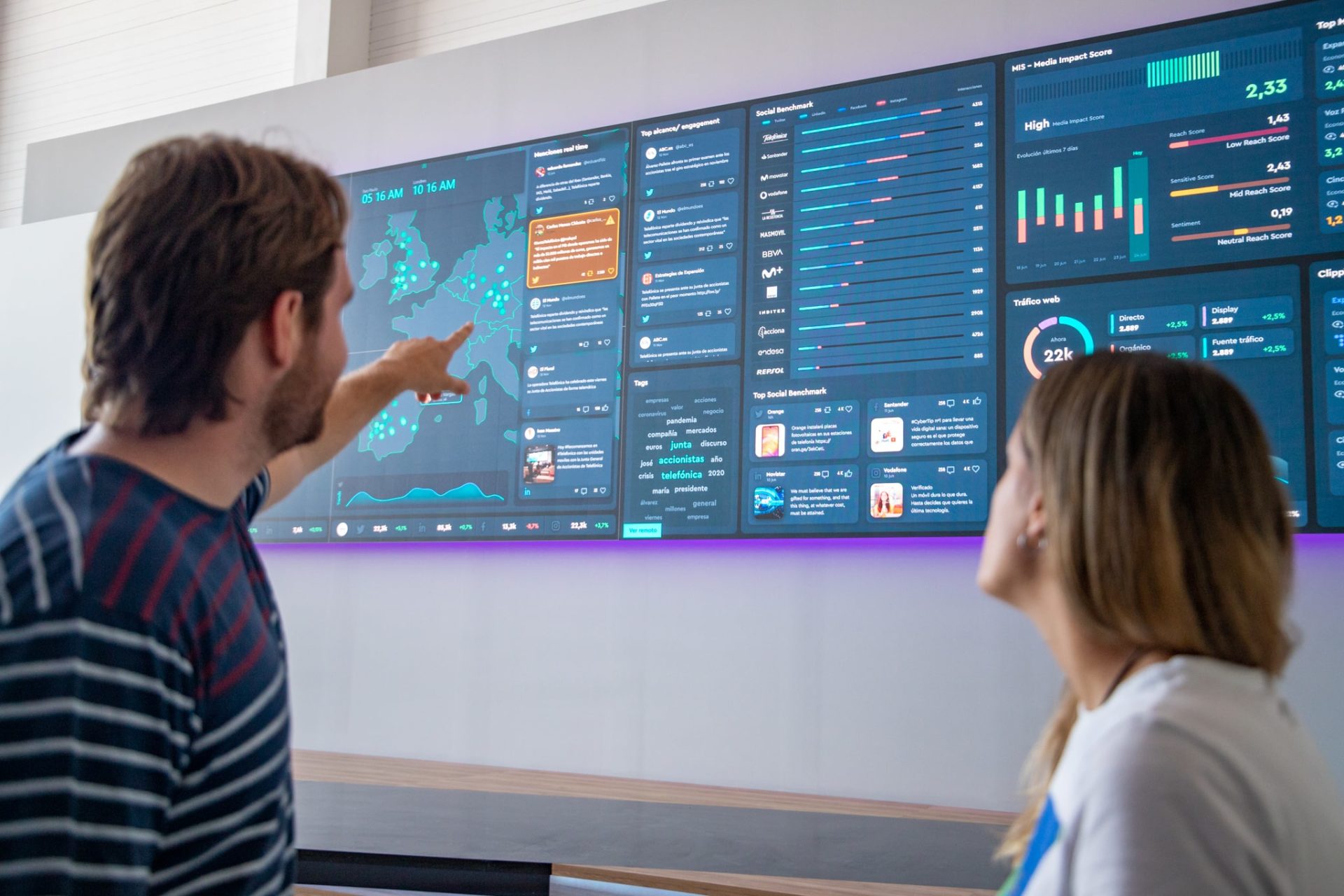
- Visual. Our brain is visual and processes images much faster than text. In addition, each company can work, on average, with between 20 and 50 different sources of information. So the dashboard is a visual ally that allows us to consume information in a clearer way through graphs, tables and other visual elements (images, icons, maps, etc.).
- Customized and adaptable. Each company is different and has different needs and objectives. The good thing about the dashboard is that it is a flexible and adaptable tool, choosing which KPIs to show, in which format, with which graphics and colours, etc.
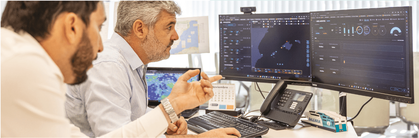
- Accessibility from different devices. The dashboard can be consumed in different formats. Which one to choose depends on who is going to consume the information. If it is a management dashboard, a TV or desktop format is best, so that the manager has direct and constant access to the information. However, if the information is going to be consumed by the sales team, it makes more sense for the dashboard to be mobile.
- Interactivity and functionality. The aim of the dashboard is to improve decision-making and communication and to make teams feel more integrated with the data. That is why the dashboard goes beyond just displaying KPIs. It is also interactive and can have a layer of filters, user roles and information segmentation; functionalities designed to allow the user to explore and exploit the information in a deeper and more detailed way.
- Intuitive and user-friendly design. The dashboard is consumed by people. Therefore, the information must be shown in an intuitive way. How to place the elements on the dashboard or what graphics and colours to use are some of the data visualisation practices that are taken into account when designing them.
Examples of dashboards
In this article we give you a detailed account of some examples of dashboards depending on the sector and people who will consume the data.
If you know what is a dashboard, you’ll know there is no a generic dashboard. The key is to identify which KPIs to consume, who is going to consume them, from where and for what purpose. Based on that, we will be able to have a dashboard that is effective and helps to make real decisions.
Here are some examples of ultra-visual dashboards:
Marketing Dashboard
Measuring and understanding data is key to understanding what is happening with our marketing actions: active advertising campaigns, online shop, brand reputation, social networks…
The marketing dashboard is key to monitoring and analysing the performance of our strategy and some of the most common marketing KPIs are:
- Website traffic.
- Conversions.
- Ad clicks.
- Social media interactions.
- Cost per acquisition (CPA).
- Marketing return on investment (ROI).
Sales Dashboard
The sales dashboard has become a great ally for many sales teams. Not only does it allow sales performance to be tracked, but it is also possible to clearly monitor objectives by area, by salesperson, by product. It can also be used to detect consumer trends, anticipate customer needs, etc.
Some of the sales KPIs that can be consumed from the sales dashboard are:
- Revenue generated.
- Total quotations sent vs. accepted.
- Follow-up of sales opportunities.
- Conversion rate.
- Fulfilment of sales targets.
- Analysis of sales trends by product or region.
- Top best-selling products.
Production Dashboard
The production dashboard monitors and manages the production operations of an organisation. It gives a cross-sectional view of everything that happens in the production processes, in terms of performance, machine and operator efficiency, break times, machine faults, etc.
Some of the production KPIs to include in this dashboard could be:
- Production levels per hour/day/week/month and their comparison with historical and previous periods.
- Cycle and inactivity times.
- Rate of defective production, rework and reprocessing. This allows us to take corrective action to improve quality and reduce costs.
- Inventory levels and expected lead times.
- Historical production trends, seasonal patterns and fluctuations in demand. This helps us to forecast future production requirements and even anticipate them.
HR Dashboard
The HR dashboard is a visual representation of the company’s employee-related data. In this way, both employees and managers have the relevant information at their fingertips and at a glance. Without having to ask for the information, the data is accessible to the interested parties so that they can organise themselves and make decisions based on how many days of holiday are left or how many hours are pending, for example.
Some HR KPIs that are reflected in the HR dashboard:
- Staff turnover.
- Absenteeism.
- Employee performance.
- Level of employee satisfaction.
- Recruitment and retention cost.
- Analysis of organizational structure.
Business intelligence through dashboards
The dashboard is undoubtedly a key tool and the epicentre of decision making in companies. A great ally to grow intelligently, based on objective decisions, being able to remain competitive in an increasingly dynamic and demanding market. The dashboard provides a clear, simple and concise vision of the key metrics and KPIs for decision making.
We have accessible data. Relevant data reflected in a visual, simple, understandable and real-time way. We bring the data closer to the work teams, who not only make decisions in an agile, objective and well-founded way, but also boost their involvement in the projects and their autonomy to consume the data and make the right decisions. A dashboard is synonymous with continuous improvement in all aspects of the business: not only in terms of efficiency, but also in terms of interdepartmental communication and continuous improvement. The dashboard provides a complete overview that facilitates the detection of opportunities and helps mitigate risks.
In addition, the customization and adaptability of the dashboard makes it a versatile tool that helps to meet the strategic objectives of the company in general and the departments in particular. Whether in the field of sales, marketing, production, human resources or finance, the dashboard is a comprehensive solution for the efficient monitoring and management of operations and resources.
The dashboard not only promotes a data-driven culture, but also fosters collaboration and information flow. Clear, accessible data, informed decisions, fluid communication… all this makes the organisation a data-centric environment, ready for the challenges of the market and to achieve its objectives.
In short, the dashboard is a strategic ally. A visual tool that drives growth and innovation in companies. With data at a glance and agile decisions, the dashboard becomes a fundamental pillar on the road to innovation and success.